INTRODUCTION
Solution Delivery Life Cycle (SDLC) supports end-to-end processes and standards for developing and implementing technology solutions at KP. The mySDLC portal provides many crucial information and resources across all IT employees
WHAT IS SDLC?
PROJECT MANAGER
SOLUTION CONSULTANT
ARCHITECT
IT MANAGER
…
Visual design, UI design guidelines, Design Validations
MY ROLE
Figma, Adobe Creative Suites, Microsoft SharePoint
Tools
1 content designer, 1 developer, 1 project manager, 1 IT consultant
THE TEAM
May - August 2022
TIMELINE
THE PROBLEM
of IT employees said that they spent more than 5 minutes looking for the documents or resources that they need
successfully look for the right items
87%


THE SOLUTION
The Process

WHAT DO THE USERS SEE?
Lack of visual hierarchy
Hard to differentiate between the pages
A lot of tell me, not enough of show me
Mental overload or burden
Mismatch between the system and what are familiar
Overview of the current experience
WHAT DID THE USERS SAID
“Clunky, tough to navigate certain documentation, not intuitive”
“The design is not coherent.. they look completely different from other internal portals”
“Every time I’m in the portal, I spent more time than I should.”
“I just want to get what I want and leave the portal.”
52
IT employees were interviewed
1500+
interview hours
WHAT DID WE LEARN?
Users are expecting ease-of-use when they are in the portal, but currently, the portal is serving the opposite purpose.
FROM NEEDS TO SOLUTION
HOW MIGHT WE
create a minimal and
consistent user experience across mySDLC portals,
even with the constraints of
Microsoft Sharepoint?
-
Having a standardized visual design system helps users to confirm their expectations
-
Providing a clear and obvious search bar, and make resources easily findable; don’t bury them underneath a thousand sub-sections
-
Avoid bombarding users with too much information. Identify areas to keep text concise with the help of visuals
-
offer alternatives to help users when they are stuck and need help
DESIGN PRINCIPLES
TESTING + IMPROVEMENTS
3 major improvements in my design


Based on various feedback from the team and testing with 5 users, I continually iterated my design over the span of 3 weeks with 3 major improvements:
Most of the users mentioned that the drop-down feature requires them to take an extra step to look for the project type.
In addition, users would not know which document belongs to which project type when they select more than one project management methodology.
Removing the drop-down feature
Based on the testing, 5 out of 5 users mentioned that they want to know at which phase of the project they should complete after they have found the document that they desire.
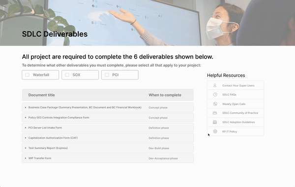
Replacing the category column to when to complete information
Upon the testing result, users want to know/learn more about documents when they are looking for deliverables, especially when they feel they are unsure.
Adding description of each document to provide more context


THE FINAL DESIGN
THE IMPACT
prefer without the drop-down function as it requires an extra step
said when to complete is more important than the category of the deliverables
of the users could find the deliverable document.
mentioned that description for each document helps find the right deliverable


95%
All the users spend average of
1 min
LESSON LEARNED
Challenges we face
Actions we took
Starting the design without the research
can be challenging
Reach out to the stakeholders who were involved in the research
Conflicts can arise among when there are different expertise
Communicate by actively listening to others, and share what you think is right!
Constraints restrict what we can/want
do in design
Not following or sometimes derail from the standardized design process
Every project and its need is different, adapt with changes and embrace uncertainties
Reframe constraints into resources, they are clue to opportunities

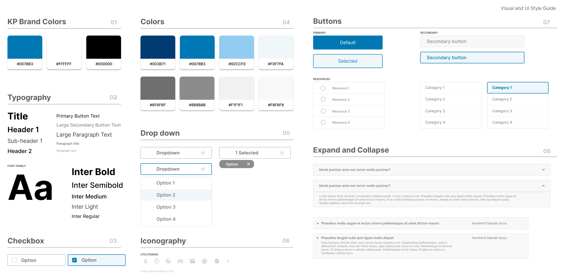
THE STYLE GUIDE